FoxyCart 2.0 represents our attempt to bring everything that you love about our platform into the modern era of web development. This has involved significant efforts from the team as we have quite literally rebuilt most, perhaps all, of the front-end code to make things faster and cleaner. As we implemented the new design, we took the opportunity to bring our cart and checkout in line with modern accessibility practices. Accessibility has been woven into the 2.0 cart and checkout, and not as an afterthought. It is my personal belief that everything on the web should be made available to all people as much as possible, and we’ve attempted to apply that philosophy to FoxyCart. I’ll go on record: a site that isn’t accessible shouldn’t be considered a well-made site.
Of course, the danger in such a high-minded principle is that we’re going to look even worse when we miss the mark. So with that in mind, I have two goals for this post:
- To share what we’ve done for this next release of FoxyCart and the resources I found to be helpful
- To invite critique, suggestions, and further information about what we can do to make FoxyCart as accessible as possible. FoxyCart 2.0 is coming soon, but our work to make it accessible probably won’t ever be complete, and we’re ok with that. Hopefully we’re on the right path. The context of this post is e-commerce because that’s what we do here at FoxyCart, but the resources and principles should apply to the web as a whole.
Thinking About Accessibility
If you’re running an online storefront or donation form, I hope it is not a big leap to assume that you would like for users to give you money. Accessibility, in this context, can therefore be defined as removing as many obstacles as possible that may keep your customers from completing a transaction. So while as mentioned above, I firmly believe that accessibility is a mandatory feature no matter what you’re working on, a secondary benefit is that you open the door for more transactions – a goal that all business owners surely desire.
What then do you need to consider and do to make your site accessible? Allow me to summarize what two other sites, A11Y Project and WebAIM, have documented more in depth (I’ll post all the links I’ve found at the end of this post as well).
Making Your Site Accessible
Visual disabilities vary from color blindness to full blindness, and there are a number of tools to help. The first thing you can do in the design stage of your site is take into consideration that color blindness affects about 8-10% of the population (source). A little bit of education can go a long ways towards helping you choose color combinations that retain contrast even if their actual hues aren’t discernible to the viewer. Andy Baio has some examples and a longer explanation on his site. There are numerous online tools that will help you see what a colorblind person might see – I used Coblis, a color-blindness simulator, and have also explored Color Oracle when checking the contrast of some of our error messages.
Some users may not be completely blind but may have visual impairments that hinder their ability to see smaller text. That doesn’t mean you shouldn’t use smaller text, but it does mean you should always check that your site doesn’t break horribly when zoomed in on a browser. Take advantage of a browser’s built in zooming feature to make sure things actually get bigger – especially if you’re doing anything with overlays, modals, or javascript-based DOM manipulation.
But what about users who are legally or fully blind? Typically they use screen readers – devices that speak the text that is on screen. HTML has numerous features built in so that you can make your site a pleasant experience for users with screen readers. Here’s the high level overview of what building with Screen Readers in mind requires:
Make the flow of your HTML logical
Modern designs often take advantage of grids and absolute positioning to move elements around on a page, but you should always pay attention to how the actual HTML flow works. Screen readers read from the top to the bottom, so if you insert a dynamic element at the bottom of your page and then use CSS to pin it to the top, beware that screen readers may not see this! This becomes particularly tricky with responsive design, as often times the struggle of reflowing content based on screen-width results in hacks and tricks to accomplish the end goal. Always keep in mind the compromises you’re making when employing these tricks.
Provide extra information with HTML Attributes
A simple but easy to overlook step you can take to make your pages more accessible is to add the alt=“” attribute to images. Screen readers can’t see an image, so they read the alt text. Not providing it means you leave out key context for your users. Similarly, if you have a link, make sure the hyperlink text is clear out of context. If a user is skimming via tabbing through the links, a “click here” link makes much less sense than a “visit the About page” link.
One of FoxyCart’s big features is obviously the checkout form, so we’ve worked hard at making it accessible. As such, we’ve focused on the simpler parts like making sure that every input on the page has a corresponding label where the for attribute matches the id of the input. Our HTML didn’t originally have this because we are taking advantage of the HTML5 “placeholder” attribute for cleaner forms. Old versions of IE don’t support “placeholder” though, so adding a label for screen readers also gives us the ability to create elegant fallbacks for older browsers. If you have a form with labels created for screen readers, make sure you understand the rules of what screen readers “see”. We’ve also worked to add ARIA attributes where it makes sense, such as when required fields have missing or invalid values. There is a great deal of information on ARIA and the ways it can help you as you build robust internet applications, so make sure to spend a little time researching.
Use Semantic HTML
HTML5 introduced new elements such as <nav> and <section> that allow you to delineate the page hierarchy with the HTML itself, along with the pre-existing tools we had such as form element groups and header levels. All of those tools are designed to help us write clearer HTML, which has value beyond just making your job as a developer easier. Using these elements well allows screen readers to understand the sections of your site and allow users to navigate the page with more context. There’s a lot more on the what and why of Semantic HTML at HTML5Doctor.
Learning More
I linked above to WebAim and the open-source A11Y Project but there are plenty of other resources. One thing I found helpful for a high level overview is this presentation by Mark Sadecki. If you’re using Twitter’s Bootstrap, there’s a plugin that makes many of the elements available for the keyboard and screen readers. O’Reilly has a book (which, full-disclosure, I haven’t yet read) about conforming your site to Section 508 of the US Rehabilitation Act. And if you want to make your accessibility efforts slightly more automated, look into this automated accessibility testing service.
Beyond these education links, I was recently re-inspired about how important this is when I read Jenn Schiffer’s recent post Accessibility and Building the Web for everyone because sometimes it’s not all about us. It’s a great reminder that these are real issues affecting real people.
Keeping everything in mind may not be simple, and in fact it often means reworking or reconsidering your approach to big aspects of your project. But writing good Javascript isn’t easy, and writing maintainable CSS isn’t easy, and web-development in general isn’t easy. We do it anyways, because of the potential for a brighter future, one where anyone can access the information and resources they need. Hopefully we can all keep pushing forward to do the hard – but necessary – work to make the web friendly and usable for all people.
FoxyCart’s accessibility efforts are definitely a work in progress. Notice something we aren’t doing well?We care. Please email or drop a note on our forum or tweet at us and let us know what we can do better!
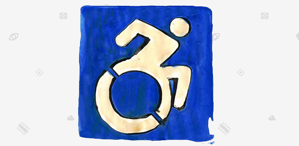
BONUS: You may notice that the accessibility icon at the top of the post is different from the ones typically seen on signs. It’s a proposed replacement icon created by the Accessible Icon Project and I first learned about it on the podcast 99% Invisible. Perhaps you too will find the goals and philosophies expressed on those sites educational.